Client : Photos By Seven
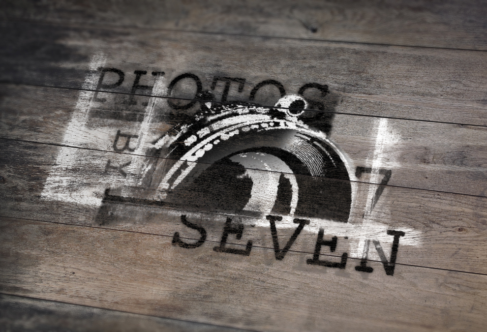
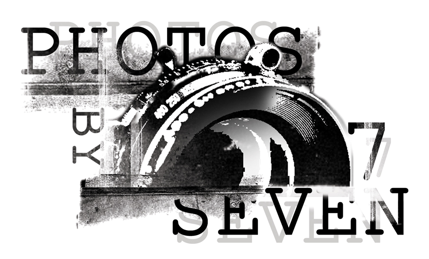
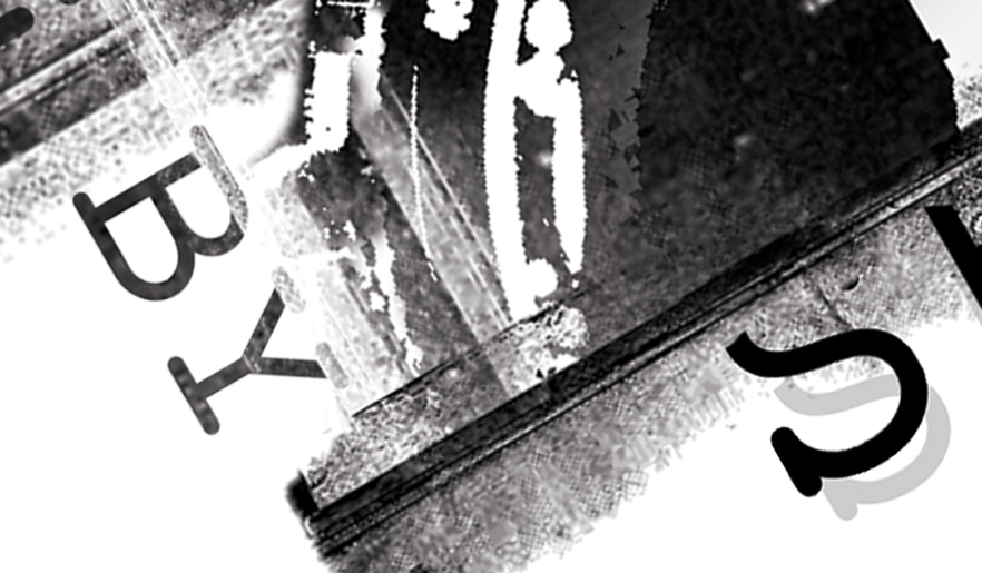
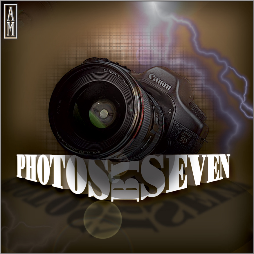
We crated this logo for a local Photographer/Camera Operator/Key Grip that was starting a business and needed business cards. When asked to provide a logo, there wasn’t one, so we threw a few concepts out and the black and white grunge logo stuck (my personal favorite). During that time we were really into distressing and making things look old – the whole grunge vibe. I used a simple font, took a color photo of a canon lens (what the client uses in the field every day) and crushed the blacks and turned it into line art. Then i took a random building photo, cut it up into 2 interesting strips and flattened them the same way as the lens (by creating a few identical layers and using the threshold filter at different strengths, blending those layers together, distressed the edges using some grunge brushes until it produced the desired look), then threw them in, all the while trying to maintain balance within the design. The last part was duplicating a few of the layers, turning them white and shifting them around, changing their blend modes to get the “this only took me 10 second” look. The final step – I filled in some positive space with a soft airbrush at 25% opacity, going over and over the areas that I wanted darker until I got the image below. It was a simple logo that easily stood out due to the high contrast of the black and white and reflected what the client actually did, which was take photographs.
Company
Dre5 Productions
Year
2007
Credits
Design : Andrei Mignea
